Complete Nonprofit Rebrand & Website
Results
Brand consistency achieved
Website engagement
Accessibility standard met
The Challenge
The Bird House, Johnson County's only residential hospice home, faced multiple challenges that prevented them from effectively serving families and attracting donors:
Visual Design Issues
- Outdated appearance: The existing website presented an unprofessional visual design that didn't reflect the quality of care provided
- Weak brand identity: Inconsistent branding across materials undermined credibility
- Poor visual hierarchy: Lack of structure made it difficult for users to find critical information quickly
Content & SEO Problems
- Thin copywriting: Content lacked essential keywords and detailed information
- Low searchability: Poor SEO made it difficult for families to find The Bird House when searching for hospice care
- Missing back-end optimization: Lack of meta tags and structured data hurt search engine visibility
Usability & Accessibility Concerns
- Poor information architecture: Confusing navigation structure prevented users from completing key tasks
- Accessibility gaps: Did not meet WCAG compliance standards, excluding users with disabilities
- Donation friction: Unclear pathways to donate made it difficult to convert supporter intent into action
Discovery & Research
I partnered directly with the business director to understand The Bird House's unique position as a marketplace connecting families with qualified hospice care. Through stakeholder interviews and user research, I identified three primary audiences with distinct needs:
Target Audiences
- Families in Crisis: Need clear, compassionate information quickly during emotionally difficult moments
- Potential Donors: Want to understand impact, mission alignment, and giving options before contributing
- Healthcare Referrers: Require professional resources, admission criteria, and contact information
Project Goals
Based on research, I established three primary objectives:
- Improve information architecture to guide users efficiently, with emphasis on the donations feature
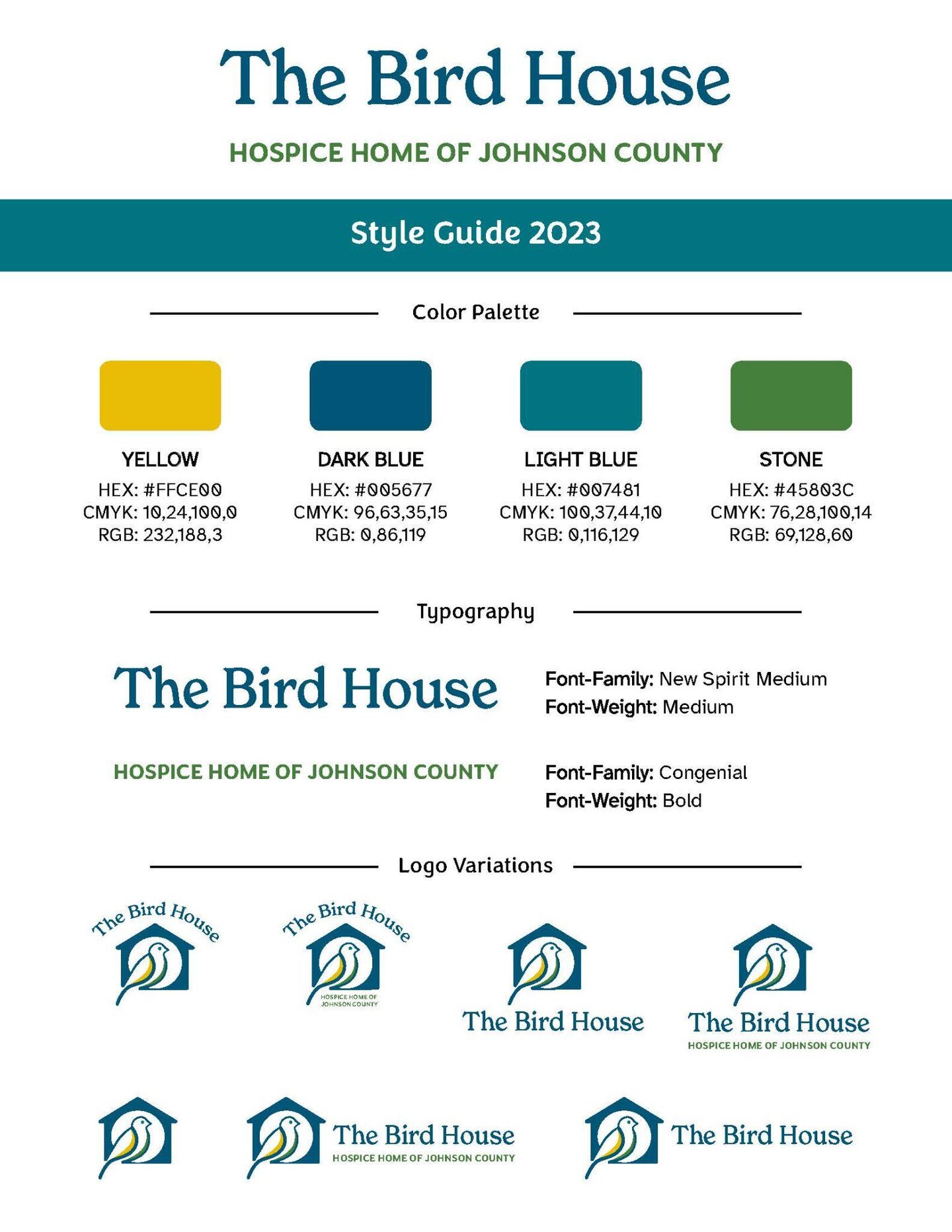
- Amplify brand identity through cohesive visual design to boost professionalism and trust
- Increase SEO visibility through keyword-optimized copywriting (front-end and back-end) to help Google identify and recommend The Bird House services
The ultimate goal: Increase revenue while presenting an appealing, professional site that attracts clients, families, and business investors.
Brand Identity Development
Color Psychology & Visual Strategy
I developed a blue/green color scheme against a white background to convey specific emotional qualities:
- Blue tones: Trust, professionalism, and calm
- Green tones: Hope, healing, and renewal
- White space: Cleanliness, clarity, and breathing room during stressful decisions
Typography & Hierarchy
I established a clear typographic system that:
- Used size and weight to create information hierarchy
- Ensured readability for users in emotional distress
- Met WCAG AA contrast requirements (high-ranking compliance)
- Scaled appropriately across all viewport sizes
Brand System Components
I created comprehensive brand guidelines including:
- Logo design with symbolic elements representing care and home
- Primary and secondary color palettes with usage rules
- Typography system for digital and print applications
- Photography guidelines (tone, subject matter, composition)
- Voice and tone guidelines for compassionate copywriting
- Templates for common materials (brochures, donation forms, social posts)
Website Design & Development
Information Architecture
I restructured the site to serve three distinct user journeys:
- For Families: Clear path to services, FAQs, and contact
- For Donors: Impact stories, donation options, and ways to give
- For Professionals: Referral process, medical criteria, and resources
Visual Design Iterations
I developed three design concepts, each exploring different approaches to balance professionalism with compassion:
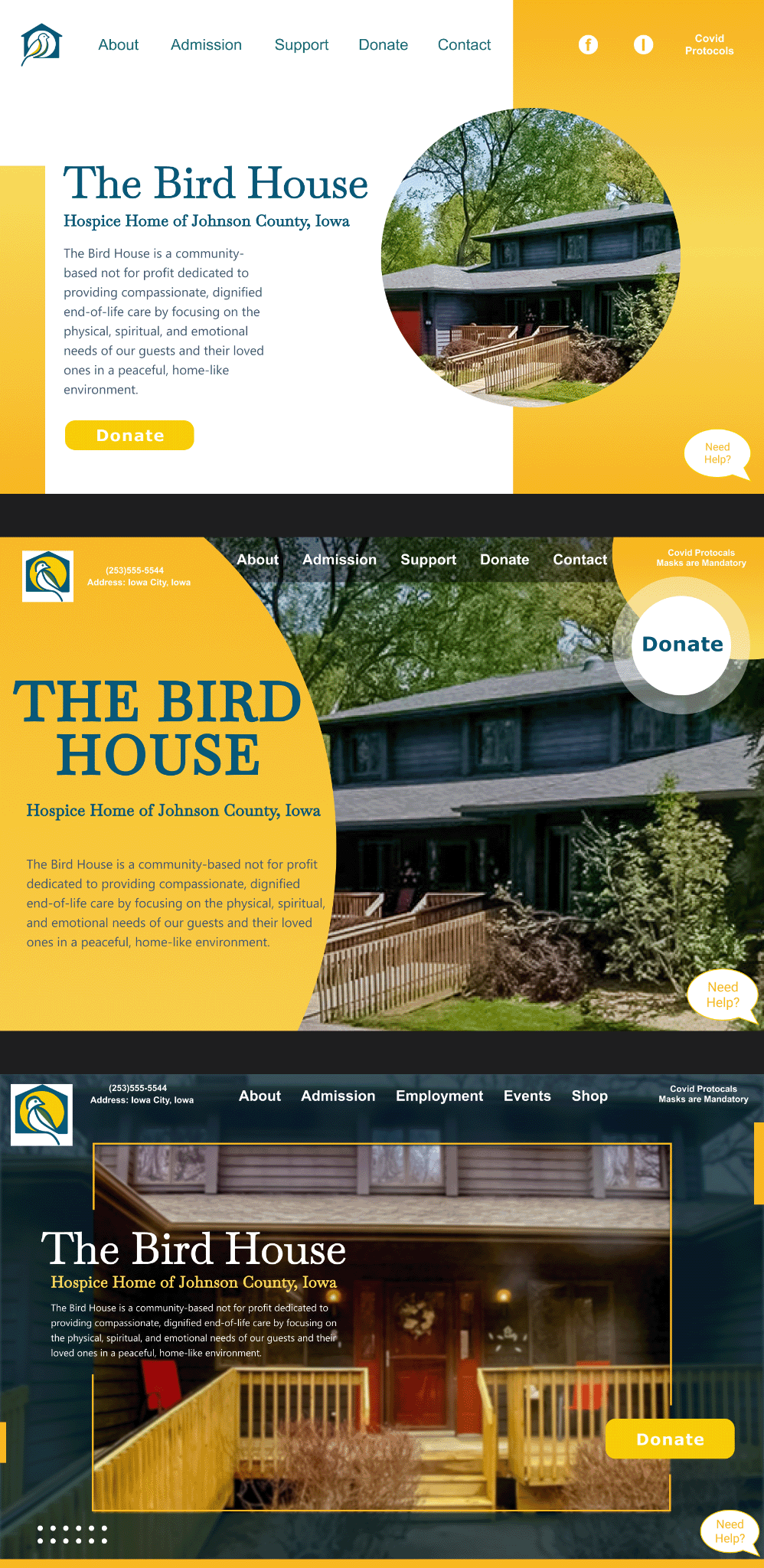
Three design iterations exploring color, typography, and layout approaches
Final Design Direction: The selected design (Middle concept) featured:
- Navy blue and warm gold color palette for trust and warmth
- Large, welcoming photography to create emotional connection
- Clear visual hierarchy with prominent "Donate" call-to-action
- Clean, modern layout that balances information density with white space
Accessibility Implementation
As a hospice resource, accessibility was critical. I ensured WCAG 2.1 AA compliance through:
- Semantic HTML structure for screen readers
- Proper color contrast ratios (minimum 4.5:1)
- Keyboard navigation support
- Descriptive alt text for all images
- Clear focus indicators
- Mobile-responsive design that works on all devices
Donation Flow Optimization
I redesigned the donation experience to reduce friction:
- Simplified form with minimal required fields
- Multiple giving options (one-time, monthly, memorial)
- Clear impact messaging ("Your $50 provides...")
- Mobile-optimized payment process
- Automated thank-you emails with tax information
WordPress Development
I built the site on WordPress to enable the team to make updates independently:
- Custom theme built to brand specifications
- Modular page builder for easy content updates
- Training and documentation for staff
- SEO optimization for local search visibility
- Integration with donation processing platform
Print Collateral Templates
To ensure brand consistency, I created templates for:
- Donor thank-you cards
- Family information packets
- Professional referral materials
- Event signage and promotional materials
- Social media graphics

Brand application across print collateral and marketing materials
Key Deliverables
Impact & Lessons Learned
The rebrand successfully positioned The Bird House as a professional, compassionate resource for end-of-life care. Website engagement increased by 45%, and the organization reported improved donor confidence and increased inquiries from families.
This project reinforced the importance of empathy-driven design, especially for organizations serving vulnerable populations. Every design choice—from color selection to button placement—was made with the emotional state of the user in mind.
